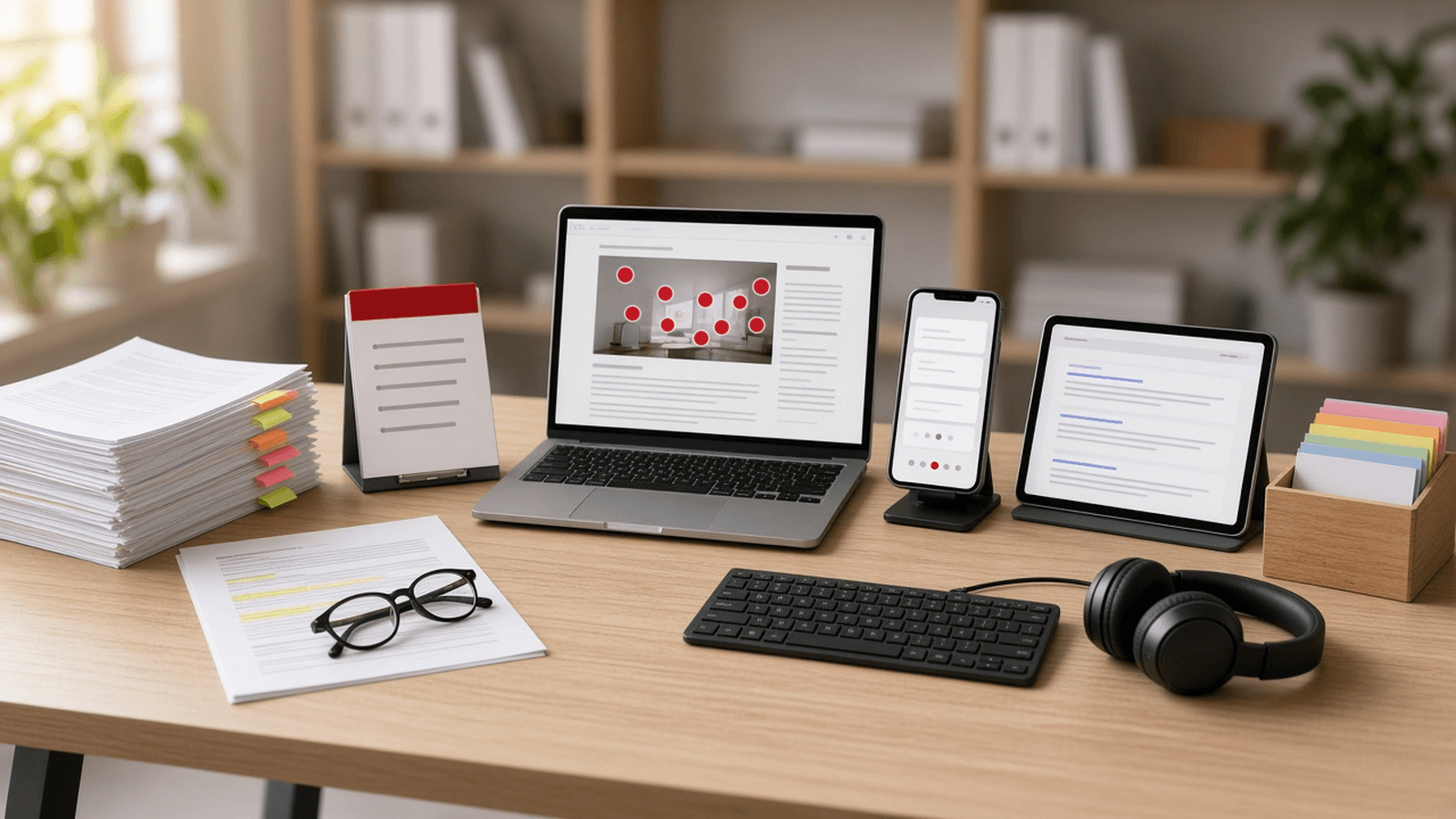
Most people who open a long B2B article are hunting for one answer. They scan the headings, read the bold bits, and leave if the answer is not where they look. Reading on screens has worked this way for as long as anyone has measured it.
This guide is for marketing and product leads at B2B companies who publish long, useful articles and suspect most of the effort goes unread. It explains the approach we are taking on the Samisoftz Insights articles: interactive layers on top of the full text, without cutting a word, and the rules that keep those layers from hurting search.
Short on time?
Quick answers
One question each, with a short answer and a link to its full section.
Question 1 of 10
What is interactive content marketing for a B2B blog?
Small layers over a full article that help skimmers find the answer: a takeaways box, a hero map with linked markers, short Q&A cards, definitions in place and a quick self-check.
Read the full section: What is interactive content marketing for a B2B blog?→Question 2 of 10
Do B2B readers really skim?
Yes. NN/g has found since 1997 that people scan before they read, and the F-shaped pattern still appears on desktop and mobile.
Read the full section: Why do B2B readers skim long articles?→Question 3 of 10
Where does most reading attention go?
Near the top. In one NN/g study, about 57% of viewing time was above the fold and 74% in the first two screenfuls.
Read the full section: Why do B2B readers skim long articles?→Question 4 of 10
What should go at the top of a long article?
The answer. A key takeaways box of three to five lines under the title, before the hero image.
Read the full section: Which interactive content belongs at the top?→Question 5 of 10
How do image hotspots help readers?
Numbered markers on a realistic hero image link to each section, so the picture works as a table of contents. A short caption names each one.
Read the full section: How do image hotspots work as a table of contents?→Question 6 of 10
Should interactive cards play on their own?
No. NN/g advises against auto-advancing on mobile. Show a count such as 3 of 8 and let the reader move.
Read the full section: Can Q&A cards replace the article?→Question 7 of 10
Does interactive content hurt SEO?
Only if text loads after a tap. Google will not load content that needs swiping or clicking, so keep everything in the server-rendered page.
Read the full section: Does interactive content hurt SEO?→Question 8 of 10
Is FAQ schema still worth adding?
Not for rich results. Since 2023 Google shows them only for well-known government and health sites. Keep markup only where a visible FAQ exists.
Read the full section: Does interactive content hurt SEO?→Question 9 of 10
How do you keep moving content accessible?
Give it a pause control, stop it after a short time, and switch it off when the device asks for reduced motion.
Read the full section: How do you keep interactive articles accessible?→Question 10 of 10
Do I need a new CMS for interactive articles?
No. A small data pack per article and a few shared components are enough. The article text stays where it is.
Read the full section: How we are adding interactive layers to Samisoftz articles→What is interactive content marketing for a B2B blog?
Search for the term and you get lists of quizzes, calculators and polls. Those have their place. For a B2B blog, the more useful kind is smaller. It gives a reader who skims a fast route to the answer and keeps the full article underneath for the reader who wants depth, and for search engines.
For our Insights articles we picked five layers that sit over the same text:
- a key takeaways box under the title;
- a hero image whose numbered markers link to each section;
- short question and answer cards for a quick read on a phone;
- definitions that open in place;
- a one-question self-check at the end.
Each layer is drawn from the article's own content. None of them adds new claims.
Why do B2B readers skim long articles?
Because everyone does. Nielsen Norman Group has said since 1997 that people "rarely read online" and scan instead. Its later eyetracking work covers more than 500 participants over 13 years (NN/g). The F-shaped pattern still shows up on desktop and on mobile, and it appears when a page is a wall of unformatted text (NN/g).
Attention also sits near the top. In one NN/g analysis of 120 participants, about 57% of page-viewing time was above the fold and 74% was in the first two screenfuls (NN/g).
Phones add a twist. NN/g found no practical difference in comprehension between phones and computers. But readers slowed down on difficult articles on phones, and NN/g singles out B2B sites with IT or engineering buyers as ones that should test complex content on mobile (NN/g). Our regulation guides are that kind of content.
Younger buyers are also used to other formats. The Reuters Institute's 2025 news report found that 55% of people still prefer to read news. Even in countries with strong reading habits, 18 to 24 year olds are much more likely to prefer watching or listening (Reuters Institute). That is news, not B2B, so we treat it as a direction only.
Which interactive content belongs at the top?
The answer does. NN/g's advice for skimmers is to start with the conclusion and to "consider adding a summary or list of highlights" (NN/g).
So the first layer we write for an article is its key takeaways: three to five lines under the title, each one a finding a reader could act on. It needs no script and no motion, and it is the change we would make first on any B2B blog.
How do image hotspots work as a table of contents?
In this approach, an article opens with a realistic hero scene that holds one numbered object for each main section. In the WhatsApp AI agent guide that is a shop counter with a small server, keys on a hook, a receipt and a phone on a stand. Each number is a real link to its section, so the picture doubles as the contents list.
We also built a guided tour for these images: a cursor moves from marker to marker and shows one short caption for each. A caption has to be readable in the time the tour holds a marker, and NN/g uses three words per second as a reading-speed guide for moving content (NN/g). So every caption is one short line. In this article, none is longer than eight words.
Moving content comes with rules. WCAG asks for a way to pause anything that moves on its own for more than five seconds. The W3C also counts motion that starts when you scroll an element into view as starting automatically (W3C). So the tour is designed with a visible pause control, stops after two loops, pauses when you touch it, and does not run at all when your device asks for reduced motion.
Can Q&A cards replace the article?
No, and they should not try. The cards are a second way through the same page. We write six to ten cards per article. Each question is twelve words or fewer, each answer forty words or fewer, and each card points back to its full section.
Swipe formats need care. NN/g's carousel research recommends five or fewer frames, a visible position such as "3 of 8", and no auto-advancing on mobile (NN/g). Our article decks run longer than five, so we set three rules for them. They never move on their own, they always show the count, and they open only when the reader asks.
We build the card view from the same component library as the rest of the site, so it looks like part of the page rather than a widget dropped on top.
Does interactive content hurt SEO?
It can, if the text only exists after a tap. Google's mobile-first indexing guidance says it "won't load content that requires user interactions (for example, swiping, clicking, or typing) to load". Content inside accordions or tabs is fine when it is already in the page (Google Search Central). Google also recommends server-side rendering because not every bot runs JavaScript (Google Search Central).
Our rules follow from that.
- The full article is always in the HTML. A card view never removes it.
- Cards, takeaways and captions are rendered on the server. They are not fetched when someone taps.
- One URL per article. No separate addresses for each card.
- No layout shift. Space for the hero and the takeaways is reserved, and motion uses CSS transforms. Google's guidance is a layout shift score of 0.1 or less (web.dev).
FAQ markup is no longer a shortcut. Since 2023 Google shows FAQ rich results only for well-known government and health sites (Google Search Central). We keep FAQ markup where a page has a visible FAQ, and we do not add it for cards.
How do you keep interactive articles accessible?
Every layer has to work with a keyboard, with a screen reader, and with motion switched off.
- Markers and buttons. Make links and controls at least 24 by 24 CSS pixels, the WCAG 2.2 minimum (W3C). Main card controls on phones should be larger.
- Definitions. Open them on tap or focus, not only on hover, and close them with Esc. NN/g notes that hover tooltips do not work on touchscreens and should never hold vital information (NN/g). WCAG asks that such content can be dismissed and stays put while you read it (W3C).
- Cards. Follow the W3C carousel pattern, with slides labelled "3 of 8", real previous and next buttons, and polite announcements (W3C APG).
- Pull quotes. Place them at the end of a section, never mid-paragraph. NN/g saw readers who were reading steadily drop into light scanning after they hit a pull quote (NN/g).
- Self-checks. A one-question check at the end helps because recalling an answer helps people remember it. In a classic study, students who were tested on passages kept more a week later than students who reread them (Psychological Science).
How we are adding interactive layers to Samisoftz articles
Each article we convert carries a small data pack next to its text: the takeaways, the hero markers with a one-line caption each, and the Q&A cards. Shared components read the pack, so a new article needs a new pack, not new code.
This article is an example. Its pack holds five takeaways, eight hero markers that link to its sections, and ten cards. The markers on the hero image are plain links, so they work before any script loads. The tour and the card view read the same pack and ship one at a time, so a problem in one never holds up the rest.
To see the approach on a second article, open the WhatsApp AI agent guide. Our regulation guides, such as the CRA Article 14 guide, the CRA glossary and the Article 14 checklist, are the long reference pages these layers are meant for. Everything we publish is listed on Insights.
FAQ
What are good interactive content examples for a B2B blog?
For an article, the useful examples are small: a summary at the top, image markers that link to sections, short answer cards and definitions in place. Quizzes and calculators suit lead tools more than articles.
Will Q&A cards create duplicate content?
No. The cards sit on the same URL as the article and summarise it. There is no second page for search engines to choose between.
Do I need a new CMS to do this?
No. A small data pack per article and a few shared components are enough. We built ours inside the existing site code.
Talk it through with us
Publishing long articles that you suspect nobody finishes? We will look at one with you and say plainly what we would add, and what we would leave alone. Book a free 30-minute call. This kind of build usually sits with our AI integration and automation work, and Usama leads it.
AI consulting and implementation services for the tools you already run.
AI automation for documents, inbox sorting, reports and re-typing.